
Composition is the silent language of photography. While technical skills are important, it's composition that often separates a good photograph from a truly memorable one. Most photographers begin by mastering basic compositional guidelines like the rule of thirds, but to create truly distinctive images, you need to expand your compositional vocabulary with more advanced techniques.
In this article, we'll explore sophisticated compositional strategies that will help you create more intentional, visually compelling, and emotionally engaging photographs.
Beyond the Rule of Thirds: Advanced Proportional Systems
While the rule of thirds provides a solid foundation, other proportional systems can bring a more refined sense of balance and harmony to your compositions.
The Golden Ratio (1:1.618)

The Golden Ratio spiral applied to a landscape composition
The golden ratio (approximately 1:1.618) has been used by artists and architects for centuries to create aesthetically pleasing proportions. In photography, it can be applied in several ways:
- Golden Spiral - Position key elements along the spiral's curve, guiding the viewer's eye through the composition
- Golden Rectangles - Divide your frame according to the golden ratio rather than equal thirds
The golden ratio often creates a more subtle, naturally flowing composition compared to the more rigid rule of thirds. Many photographers find that golden ratio compositions have a more organic, harmonious feel that's difficult to define but visually satisfying.
Dynamic Symmetry
Dynamic symmetry uses diagonal lines and geometric relationships to create balanced yet energetic compositions. Key elements include:
- The major diagonal (from one corner to the opposite)
- Reciprocal diagonals (perpendicular to the major diagonal)
- Sinister and baroque diagonals (creating different emotional responses)
By aligning key compositional elements along these diagonals, you create images with a strong underlying structure that feels simultaneously balanced and dynamic.
Working with Visual Weight and Balance
Visual weight refers to the perceived "heaviness" of elements within your frame. Understanding how to balance these elements is crucial for creating harmonious compositions.
Factors Affecting Visual Weight
- Size - Larger elements typically carry more visual weight
- Color - Saturated and warm colors appear "heavier" than desaturated or cool colors
- Contrast - High-contrast areas draw more attention and have greater visual weight
- Sharpness - Sharp elements appear heavier than blurred ones
- Isolation - Isolated elements gain visual importance
- Position - Elements placed higher in the frame often appear "heavier"
Types of Balance

Example of asymmetrical balance with a small high-contrast element balancing larger muted forms
Understanding different types of balance allows you to create compositions with specific emotional qualities:
- Formal/Symmetrical Balance - Creates a sense of stability, formality, and permanence
- Informal/Asymmetrical Balance - Produces more dynamic, energetic compositions
- Radial Balance - Elements arranged around a central point, creating a sense of movement
- Crystallographic Balance - Repeating patterns throughout the frame, creating rhythm
Remember that deliberate imbalance can also be a powerful compositional choice, creating tension or directing attention to specific elements.
Negative Space as a Compositional Tool
Negative space—the empty areas surrounding your subject—is as important as the subject itself. Advanced photographers understand that negative space isn't just "background" but an active compositional element.
Functions of Negative Space
- Creates breathing room, preventing visual clutter
- Emphasizes the subject through isolation
- Establishes mood (expansive negative space can create feelings of solitude or freedom)
- Suggests narrative context
- Creates visual metaphors (e.g., a small subject in vast negative space suggesting insignificance)
Activating Negative Space
Rather than treating negative space as passive, consider how to make it an active element:
- Use subtle textures or gradients that add interest without competing with the subject
- Incorporate complementary colors that enhance the subject
- Create shapes in negative space that echo or contrast with the subject's form
Creating Visual Flow and Movement
Strong compositions guide the viewer's eye through the image in a deliberate way. This visual journey creates engagement and helps communicate your intended message.
Directional Elements

Multiple leading lines creating a complex visual flow through the image
Several compositional elements can create movement and direct the viewer's gaze:
- Leading Lines - Direct the eye along a specific path
- Implied Lines - Created by alignment of multiple elements or by gaze direction
- Repetition with Progression - Elements that repeat with gradual change create rhythm and movement
- Directional Energy - Subjects with clear directionality (e.g., moving vehicles) suggest movement
Advanced Line Work
Different types of lines evoke different psychological responses:
- Horizontal lines - Suggest stability, tranquility, and rest
- Vertical lines - Convey strength, growth, and dignity
- Diagonal lines - Create dynamism, tension, and movement
- Curved lines - Evoke grace, sensuality, and natural flow
- Converging lines - Draw attention to their intersection point
- S-curves - Create elegant movement through the frame
Advanced compositions often incorporate multiple types of lines that work together to create a cohesive visual experience. For example, combining strong diagonals with subtle s-curves can create both energy and grace.
Gestalt Principles in Photographic Composition
Gestalt psychology explores how humans perceive visual information, particularly how we organize individual elements into unified wholes. Understanding these principles can help you create more cohesive and impactful compositions.
Key Gestalt Principles for Photographers
- Similarity - Elements that share visual characteristics are perceived as related
- Proximity - Elements placed close together are seen as belonging to the same group
- Continuity - The eye follows the smoothest path rather than abrupt changes in direction
- Closure - The mind fills in missing information to complete shapes
- Figure-Ground - How we distinguish objects from their backgrounds
- Common Fate - Elements moving in the same direction are perceived as related
By consciously applying these principles, you can create images where the viewer intuitively understands the relationships between elements.
Figure-Ground Relationships

Strong figure-ground relationship creating visual impact
The relationship between subject (figure) and background (ground) can be:
- Stable - Clear distinction between figure and ground
- Reversible - Figure and ground can swap roles (creates visual intrigue)
- Ambiguous - Unclear distinction between figure and ground (creates tension or mystery)
Advanced photographers often play with these relationships, sometimes deliberately creating ambiguity to engage the viewer more deeply.
Layering and Depth
Creating a sense of depth transforms flat photographs into immersive visual experiences. Layering—incorporating distinct foreground, middle ground, and background elements—is a powerful way to achieve this dimension.
Techniques for Creating Depth
- Overlapping elements - When objects overlap, we perceive spatial relationships
- Atmospheric perspective - Distant objects appear less saturated and lower in contrast
- Scale relationships - Placing similar objects at different distances reveals spatial depth
- Selective focus - Creating distinct planes of focus
- Perspective and diminishing lines - Parallel lines converging in the distance
Creating Visual Hierarchy Through Layers
Each layer in your composition can serve a specific purpose:
- Foreground - Often provides context, framing, or invites the viewer into the scene
- Middle ground - Typically contains the main subject or action
- Background - Provides context, mood, or supporting elements
By thoughtfully considering the relationship between these layers, you create photographs that reward extended viewing as the eye travels through the various depths of the image.
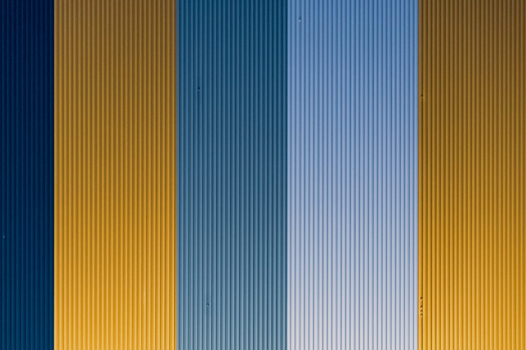
Color Theory in Composition
Advanced color composition goes beyond simply including attractive colors to creating deliberate color relationships that support your creative vision.
Color Schemes and Their Emotional Impact

Complementary color scheme creating visual tension and impact
Different color relationships create different emotional responses:
- Complementary colors (opposite on color wheel) - Create vibrance and tension
- Analogous colors (adjacent on color wheel) - Create harmony and cohesion
- Triadic colors (equidistant on color wheel) - Create balanced vibrancy
- Split-complementary - Offer contrast with more harmony than strict complementary schemes
- Monochromatic - Create unity and emphasize texture and form
Color as a Compositional Element
Color can be used strategically to:
- Direct attention to specific areas (through selective saturation or contrasting colors)
- Create visual weight (warm and saturated colors appear "heavier")
- Suggest mood or temperature
- Unify disparate elements
- Create depth (warm colors appear to advance, cool colors recede)
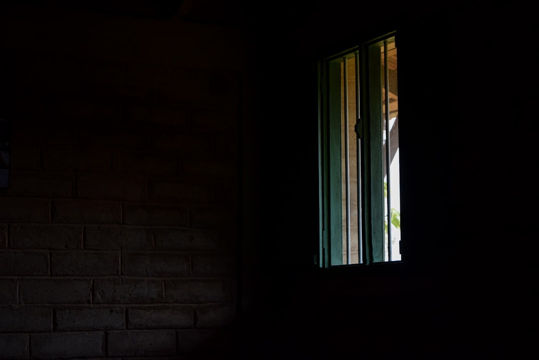
Frames Within Frames
Using natural or architectural elements to create a frame within your composition is a powerful technique that can:
- Direct attention to your subject
- Add contextual information
- Create a sense of depth
- Add narrative quality by suggesting the viewer is looking through something
Types of Internal Frames
- Complete frames - Surround the subject on all sides
- Partial frames - Frame the subject on only some sides
- Implied frames - Suggested through lines or shapes that don't fully enclose the subject
- Multiple nested frames - Create a sense of progressive revelation
Internal frames can be literal (doorways, windows, arches) or created by natural elements (tree branches, rock formations) or even by light and shadow.
Juxtaposition and Contrast
Juxtaposition—placing contrasting elements side by side—creates visual tension and intellectual engagement. This technique can communicate complex ideas and emotions that might be difficult to express with a single subject.
Elements That Can Be Juxtaposed
Juxtaposition of old and new architectural elements creating visual commentary
- Scale - Large versus small
- Age - Young versus old
- Texture - Rough versus smooth
- Shape - Organic versus geometric
- Concept - Nature versus civilization, wealth versus poverty
- Color - Complementary colors or monochrome versus vibrant
Effective juxtaposition often creates a visual metaphor or makes a statement about the relationship between the contrasting elements.
Breaking the Rules Deliberately
Once you understand compositional principles, you can deliberately break them for creative effect. Breaking rules can create tension, surprise, or emphasize certain aspects of your image.
Examples of Rule-Breaking for Creative Effect
- Centered composition - Can create formality, stability, or emphasize symmetry
- Tilted horizons - Create dynamism or disorientation
- Deliberate imbalance - Creates tension or draws attention to negative space
- Extreme minimalism - Breaks multiple "rules" to create stark simplicity
- Intentional clutter - Can communicate chaos or complexity
The key is to break rules with intention rather than by accident. When you understand why you're breaking a rule and what effect it creates, the result will be much more powerful than random composition.
Putting It All Together: The Iterative Process
Advanced composition is rarely achieved in a single step. Most masterfully composed photographs result from an iterative process:
- Identify your subject and intent - What are you trying to communicate?
- Consider the compositional elements available - What lines, shapes, colors, and relationships exist in the scene?
- Make initial compositional choices - Select techniques that support your intent
- Evaluate and refine - Assess how well your composition serves your vision
- Make adjustments - Reposition, reframe, or wait for changing conditions
This process might happen very quickly for experienced photographers, but it always involves conscious decision-making rather than simply "taking what's there."
Conclusion: From Technique to Expression
Advanced composition is ultimately about communicating your unique vision and perspective. While these techniques provide powerful tools for creating compelling images, they should serve your creative expression rather than constrain it.
As you practice these advanced compositional strategies, you'll find yourself moving from conscious application of techniques to intuitive expression. The best compositions often combine multiple principles in ways that feel natural and inevitable rather than forced or formulaic.
Remember that great composition isn't about rigidly following rules but about making deliberate choices that support your photographic vision. By expanding your compositional vocabulary with these advanced techniques, you'll have more tools to express exactly what you want to say through your photography.

Comments (4)
Michael Chang
June 16, 2024The section on visual weight completely changed how I look at my compositions. I've been struggling to understand why some of my technically correct images felt "off" - now I see it was about balancing visual elements. Thank you!
Jessica Miller
June 15, 2024I've always found the golden ratio a bit intimidating, but your explanation makes it much more approachable. Do you have any recommendations for apps that can overlay these patterns on images to help practice seeing them?
Olivia Martinez
June 15, 2024Hi Jessica! For practicing with the golden ratio, I recommend the app "Phi Grid" for mobile and "Golden Ratio" plugin for Lightroom. There's also a free web tool called "Composition Cam" that lets you upload images and overlay various compositional guides. Practice with these and soon you'll start seeing these patterns naturally!
David Wilson
June 15, 2024The juxtaposition section really resonated with me. I've been experimenting with contrasting elements in urban photography, and it's amazing how powerful these visual contrasts can be for storytelling. Looking forward to trying some of these other techniques as well!
Leave a Comment